Case Study
Transit App — Direction Indicator Enhancement
Project Overview
The Product
A UX/UI improvement for the Transit app, a real-time mobility tool that helps users plan routes, track vehicles, and navigate public transportation efficiently.
My Role
UX Researcher, UI Designer
The Problem
When users tap a bus line from the map view, it is not immediately clear which direction the bus is traveling. This leads to confusion, unnecessary backtracking, and viewing the wrong schedule.
The Solution
A small but impactful update:
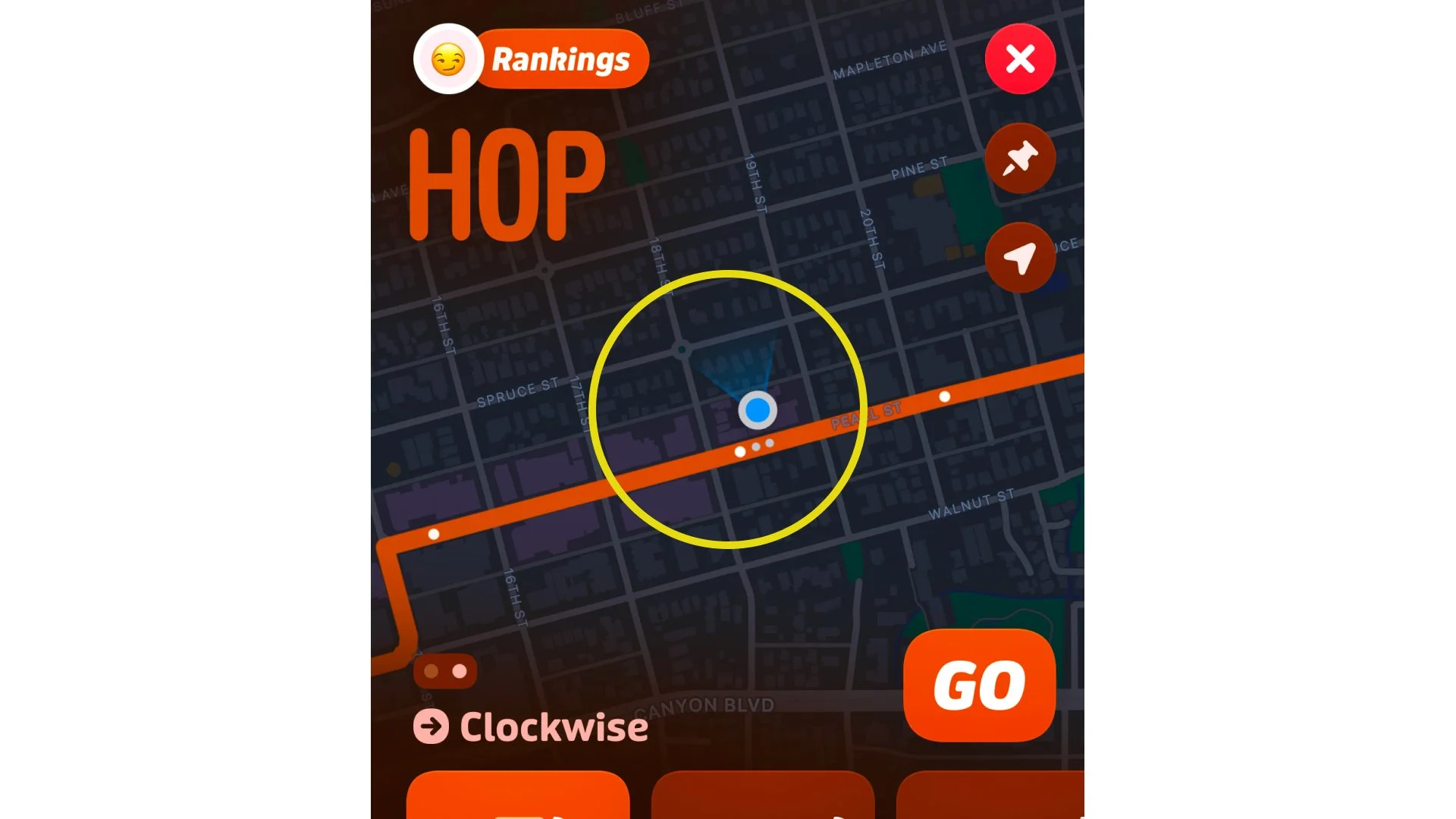
Move the direction arrow from the route’s starting point to the user’s selected stop.
Maintain Transit’s existing visual language for consistency.
Reduce errors and confusion by helping users confirm direction at a glance.
The Goal
Make bus direction instantly recognizable without adding new interface elements or disrupting existing design patterns.
Validation Strategy
Measured impact through usability testing and A/B comparisons focused on:
Accuracy identifying the correct direction
Time on task to confirm bus route
User confidence after interaction
User Research and Discovery
Understanding the Problem
This project began with firsthand experience. While using the app, I noticed that bus direction was not immediately clear.
To validate this observation, I conducted six quick field interviews with Transit users at bus stops around Boulder, Colorado. All participants were college students familiar with mobile navigation apps.
What I found:
All participants experienced confusion identifying direction.
Some relied on bus movement on GPS to infer direction.
Others reopened the route multiple times to confirm the correct view.
These consistent patterns confirmed a clear usability gap and grounded the redesign in real user behavior.

Heuristic Evaluation
Understanding the Current Experience
Before moving into design solutions, I conducted a heuristic evaluation of the Transit app’s map view, focusing on how directionality is communicated. The analysis revealed several usability gaps that create confusion when determining which way a bus is traveling.
1. Direction Not Immediately Visible
Problem:
The direction of travel is not visually clear unless users rely on moving bus icons. When no vehicle is visible, users must guess which direction the route represents.Heuristic Violation:
#1 (Visibility of System Status)Solution:
Introduce a clear, static visual indicator of direction that remains visible regardless of bus movement. This ensures users can always understand route direction without depending on real-time updates.
2. Arrow Placement Misaligned with Real Use
Problem:
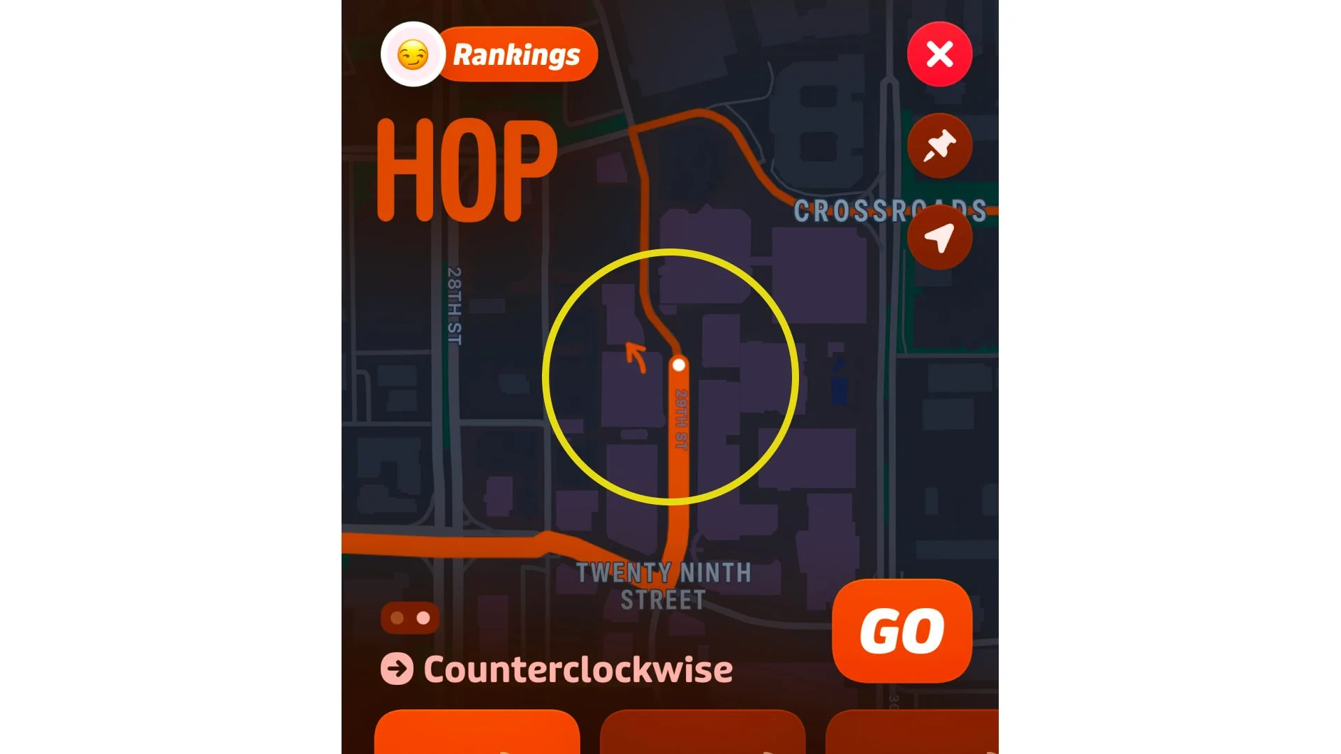
Arrows appear only at the starting stop for some routes, suggesting a fixed interpretation of directionality. Most users board mid-route, so this placement does not match how people actually use transit.Heuristic Violation:
#2 (Match Between System and Real World)Solution:
Relocate the direction arrow to the user’s selected stop so it reflects the user’s actual boarding point. This aligns the visual logic of the app with real-world travel behavior.
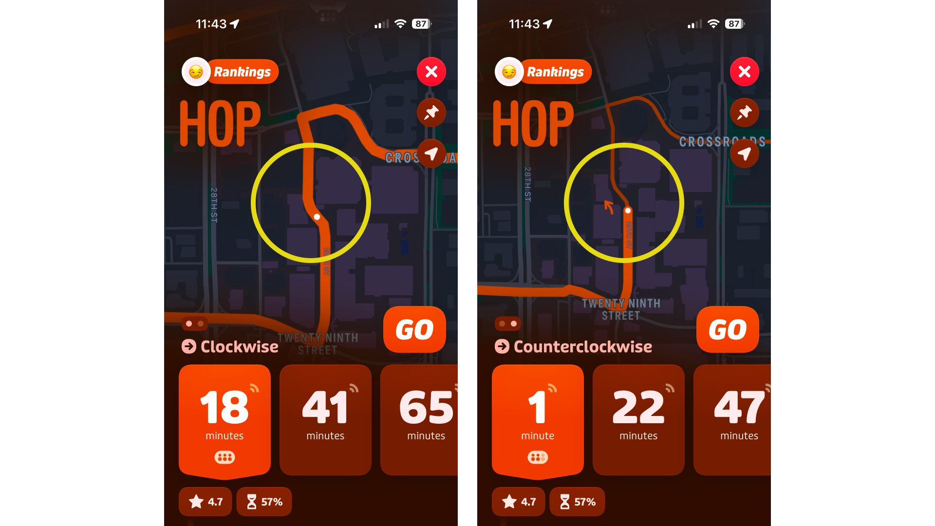
3. Inconsistent Feedback Between Directions
Problem:
Arrow behavior is inconsistent between route directions. The counterclockwise view shows a direction arrow, while the clockwise view does not. This inconsistency makes it difficult to trust the system and quickly interpret direction.Heuristic Violation:
#4 (Consistency and Standards)Solution:
Apply direction arrows consistently across both map views to reinforce predictability and help users understand direction at a glance.
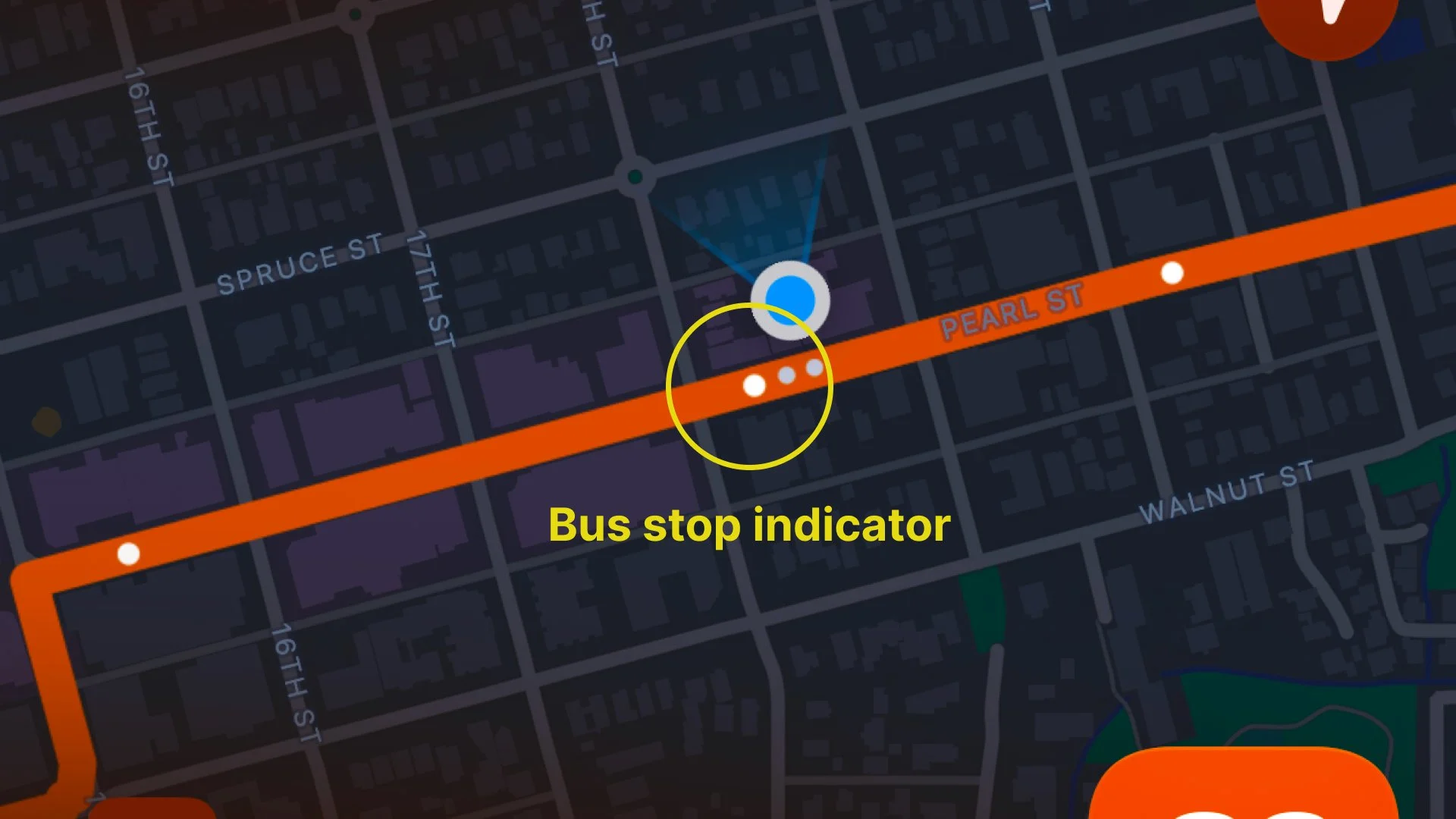
4. Unclear Visual Cue in Line Thickness
Problem:
One side of each bus stop marker is drawn with a noticeably thicker line segment than the other. This appears to be an intentional visual cue to indicate directionality, but it is unclear whether the bus travels toward or away from the thicker segment.Heuristic Violation:
#8 (Aesthetic and Minimalist Design)Solution:
Clarify or simplify this visual treatment so the meaning of line thickness is unambiguous. Either remove this cue or pair it with a clear directional symbol to ensure immediate comprehension.
Key Insights
The app contains visual ambiguity in how it communicates direction, forcing users to rely on movement or map zooming to infer orientation.
Inconsistent arrow behavior across route directions breaks predictability and reduces trust in the system.
Directional cues lack clarity, such as line thickness and “clockwise/counterclockwise” labels that require interpretation rather than recognition.
Users invest unnecessary cognitive effort to confirm something that should be visually self-evident.
Adding small, consistent directional arrows can resolve these issues while maintaining the app’s existing design language and color system.
Design Exploration
Defining the Arrow System
Building on the findings from the heuristic evaluation, this phase focused on designing a directional arrow system that integrates seamlessly within Transit’s existing visual and technical framework.
The goal was to create a scalable, implementation-ready component that communicates direction clearly while maintaining consistency with the app’s design language.
Anchored sizing
Arrow dimensions are tied to the existing bus stop circle indicator for consistent scale across zoom levels and devices.
Placement logic
The arrow appears at the bus stop closest to the user’s location, ensuring relevance and clarity.

Dynamic visibility
The arrow is content-aware, adjusting automatically to remain visible and avoid overlap with the user geolocation indicator.
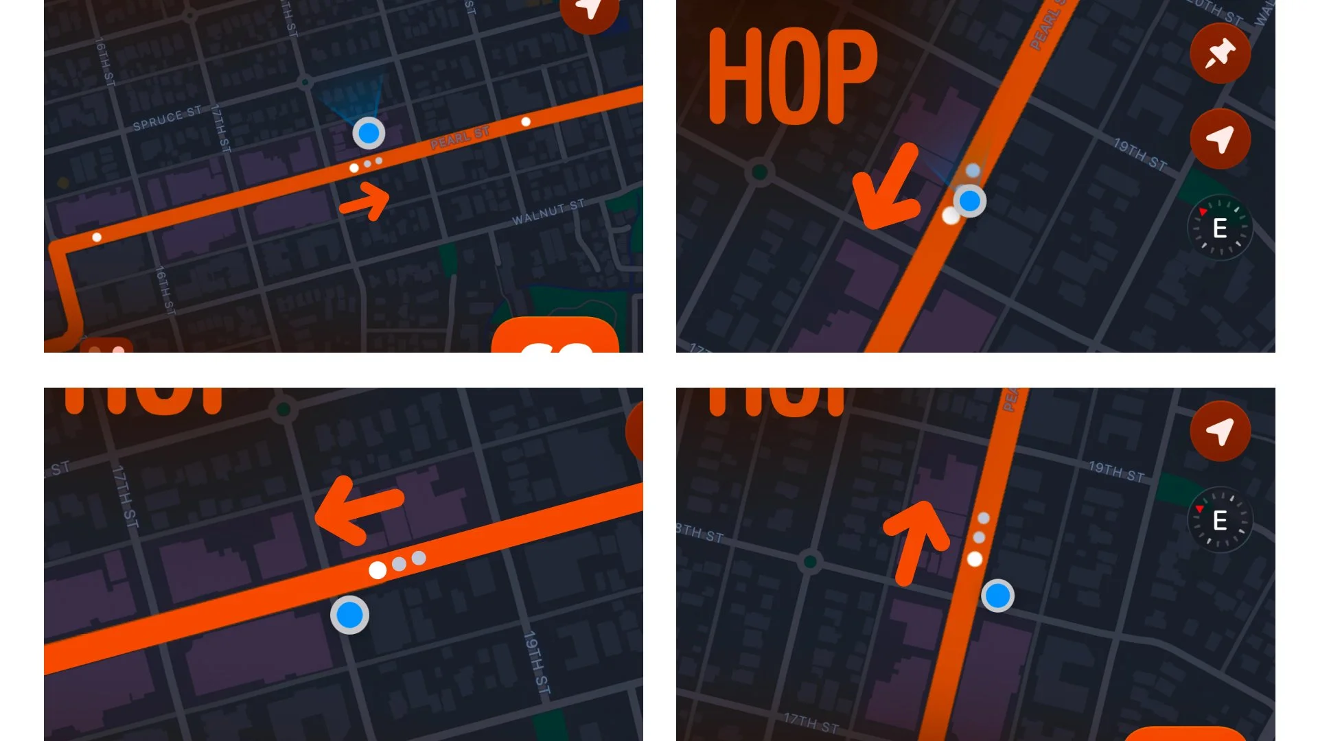
System alignment
Follows existing icon grid, stroke weight, and color tokens for seamless integration into Transit’s visual system.
Next Steps
Validating the Arrow System
To assess the impact of the proposed arrow system, the next phase would focus on usability evaluation and behavioral validation.
The goal is to determine whether the new design improves orientation speed, reduces cognitive effort, and enhances overall clarity when selecting routes.
Proposed Research Activities
Moderated Usability Testing: Observe participants as they identify bus direction using the prototype to evaluate efficiency, accuracy, and decision-making patterns.
A/B Testing: Compare task performance between the existing map and the proposed design to quantify improvements in clarity and speed.
First-Click Testing: Measure whether users correctly identify the intended direction on their first interaction with the map view.
Think-Aloud Protocols: Capture real-time reasoning to uncover how users interpret directional cues and what factors influence confusion.
Post-Test Interviews: Gather qualitative feedback on perceived clarity, ease of interpretation, and overall confidence in the design.
Example Success Metrics
Task Success Rate: Percentage of participants who correctly identify bus direction on the first attempt.
Time on Task: Average time required to determine correct directionality.
Error Rate: Frequency of incorrect or reversed direction selections.
Cognitive Load Indicators: Observed reliance on map zooming, tab switching, or waiting for bus movement to confirm direction.
Post-Test Confidence Ratings: Collected using a Single Ease Question (SEQ) or short Likert-scale survey to measure users’ perceived ease and certainty.
Perceived Usability: Overall satisfaction and confidence scores collected through the System Usability Scale (SUS) to benchmark usability improvement.